
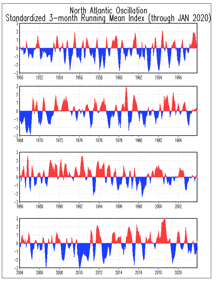
We don't need more time than the first day of spring each year to grasp reality. First let's take a brief moment to understand what this chart about the North Atlantic Oscillation represents.
Six years ago I started to study this climate phenomenon. The direct relationship between low pressure and high pressure zones over the North Atlantic that dictate the available food supply for salmon during their winter months. I have written in detail on this topic and you can review some of my findings on this link. NAO Link
For the purpose of this post I would like to talk about the comparison of resent history and what has happened as far as quantity and size of returning fish over the last ten years.
If we call the red parts of the chart positive and the blue negative we have the basis of what the oscillation is to nature. Positive is when the meeting place of the low to the north and the high to the south is north of the exact mid point between south and north of the Northern Hemisphere. This map shows the results of positive and negative effect.

It becomes a simple process of understanding that when a species that lives close to the surface and relies of a concentrated food source to survive, any disruption in that relationship will cause added demise and weight of the predictor The more climate activity over the winter that is created the greater the fall off.
Now let's go back to the first graph and analyze a few recent years. The easiest being 2011. Remember you are looking at the winter months and must take into consideration the end of 2010 and the beginning of 2011. Is there any correlation that the deepest negative in the Oscillation occurred in the previous winter of one of the best salmon seasons in memory. Look at the period between 1982 and 1994. Certainly these were the dark days when we looked to find fault with everything from sea lice to seals as the reason for our salmons decline. During the years between 2002 and 2008 there was as varied a range of success as the varied years in the chart. Is it possible that natural climate changes that have happened since the dawn of time are to blame for good and bad alike? I think so. Here is another bit of the puzzle. Why did the Stripped Bass populations grow so large during the 1980's through the early 1990's and coincidentally is the same period the salmon were in decline. I suspect for the same reason only in reverse is true and I also think that dance is in the cards for the future.
So now we come to this winter and what we think is going to happen. What do you think? Looking at the chart for this winter it would seem to be somewhat even between positive and negative The only other factor is if the beginning of a winter season is less important that how the winter finishes. Clearly the last two months have had greater negative position and this becomes a critical factor.
My feeling is that we are going to experience a very healthy early season this year and given some sense of relative weather patterns that are stable the overall picture is looking up.
Two things that I would have you do for your own conclusions would be first to consult any logs and history that you personally have gathered as well as go back and read the reports in the summer issues of the Atlantic Salmon Journals. Perhaps you can be as convinced as I am as to where all the salmon have gone.
No comments:
Post a Comment